


Pink wallpaper has moved far beyond the traditional nursery or child’s bedroom. Today, it appears in sophisticated living rooms, peaceful bedrooms, stylish dining spaces, modern offices, and even bathrooms. From soft blush backgrounds to dramatic floral murals, pink can make a room feel warmer, brighter, and more personal.
The growing appeal of pink comes from its remarkable flexibility. Pale shades can act almost like neutrals, while deeper rose, coral, raspberry, and burgundy tones create stronger visual statements. Pink also works well with many popular materials, including natural wood, brass, marble, linen, velvet, and painted furniture.
Choosing the right wallpaper is not simply about finding a beautiful pattern. You must also consider the size of the room, natural light, furniture colors, installation method, and the atmosphere you want to create. This guide explores the best pink wallpaper trends and explains how to use them confidently throughout the home.
| Label | Information |
|---|---|
| Topic | Pink Wallpaper |
| Category | Home Décor & Interior Design |
| Purpose | Refresh and enhance interior walls |
| Best For | Bedrooms, living rooms, offices, nurseries |
| Popular Shades | Blush, pastel, dusty rose, mauve, hot pink |
| Trending Styles | Floral, geometric, botanical, textured, mural |
| Common Materials | Vinyl, non-woven, peel-and-stick, paper |
| Matching Colors | White, grey, beige, green, navy, gold |
| Installation Options | Peel-and-stick or traditional paste |
| Main Benefits | Adds warmth, style, and personality |
| Maintenance | Dust regularly and clean as recommended |
| Ideal Interior Styles | Modern, Scandinavian, Boho, Vintage, Luxury |
Why Pink Wallpaper Is Popular Again
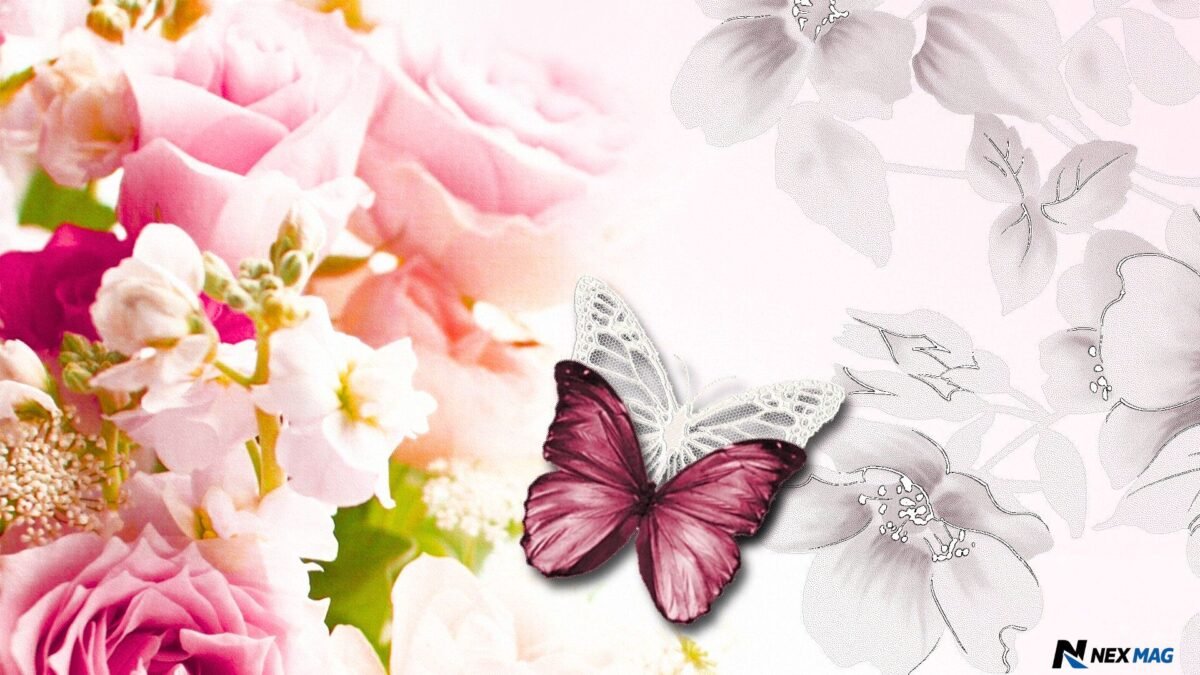
Interior design has become more personal and expressive. Many homeowners are moving away from plain white walls and introducing color, pattern, texture, and character into their rooms. Wallpaper offers an effective way to make that change without replacing all the furniture.
Pink fits naturally into this warmer approach to decorating. Muted pink shades can soften modern interiors that contain hard surfaces, sharp lines, or dark furniture. They can also add gentle contrast to rooms dominated by grey, beige, cream, or white.
Another reason for its popularity is the wide variety now available. Modern pink wallpaper does not always look sweet or traditionally feminine. It may feature geometric lines, abstract artwork, tropical plants, architectural details, vintage illustrations, textured surfaces, or dramatic landscapes.
The result is a color that can feel romantic, playful, luxurious, artistic, calm, or bold depending on how it is used.
Soft Blush Pink
Blush remains one of the easiest pink shades to introduce into a home. It has enough warmth to make a room feel welcoming, but it is usually subtle enough to live with for many years.
A plain blush wallpaper or a design with a delicate texture can replace beige or cream in a neutral decorating scheme. It works beautifully with off-white furniture, pale oak, light grey upholstery, and natural fabrics.
In bedrooms, blush pink can create a peaceful background that does not compete with bedding or artwork. In living rooms, it adds warmth without making the space feel heavily decorated. It is also a practical choice for home offices because it brings color into the room while maintaining a calm appearance.
For a more mature result, choose blush tones with a little beige, brown, or grey in them. These dusty undertones make the color feel more sophisticated and easier to coordinate.
Dusty Rose Designs
Dusty rose is deeper than blush but softer than bright pink. It is particularly suitable for elegant interiors inspired by vintage homes, boutique hotels, and classic European design.
This shade works well in floral wallpapers, damask patterns, stripes, and small repeating prints. It can also be used as the background color in panoramic or botanical murals.
Dusty rose looks especially attractive beside dark wood, aged brass, antique furniture, and warm cream paint. It can make a dining room feel intimate or give a bedroom a rich, comfortable atmosphere.
To prevent the room from looking overly traditional, combine dusty rose wallpaper with simple modern furniture. A clean-lined sofa, contemporary lamp, or minimalist bed frame can provide a useful contrast.
Oversized Floral Prints
Floral wallpaper continues to be one of the strongest wall-covering styles. The newer approach often uses flowers on a much larger scale, turning the wall into a piece of artwork.
Oversized pink roses, peonies, magnolias, and wildflowers can create an impressive feature behind a bed, sofa, bathtub, or dining table. The large pattern brings drama, but it can still feel graceful when the surrounding furniture is kept relatively simple.
When selecting a large floral design, look carefully at the background color. A pale background will usually make the room feel lighter, while a dark navy, charcoal, or forest-green background will produce a more dramatic effect.
Large flowers can also work in smaller rooms. The common belief that small rooms always require tiny patterns is not necessarily true. A large, flowing design may make the walls feel less rigid and give the room a stronger identity.
The key is balance. Allow the wallpaper to be the main decorative element and avoid adding too many competing patterns.
Delicate Botanical Wallpaper
For homeowners who like nature-inspired interiors but do not want oversized flowers, delicate botanical designs offer a softer alternative.
These wallpapers may feature thin branches, small leaves, wildflowers, birds, or climbing plants on a pale pink background. They are ideal for bedrooms, reading corners, nurseries, and relaxed living spaces.
Botanical pink wallpaper pairs naturally with woven baskets, wooden furniture, indoor plants, ceramic accessories, and linen curtains. It can help a room feel fresh and connected to nature without relying on green as the dominant color.
A small botanical print is also easier to use across all four walls because the pattern is less visually demanding than a large mural.
Scenic Murals
Scenic and panoramic wallpapers are becoming increasingly important in interior design. Instead of repeating a small pattern, these designs create a complete landscape or illustrated scene across the wall.
Pink scenic wallpaper may show misty mountains, romantic gardens, classical buildings, forests at sunset, or abstract cloud formations. The color may appear as the main background or as a soft accent within a larger composition.
Murals are particularly effective on uninterrupted walls where the entire design can be appreciated. Bedrooms, dining rooms, stair landings, and home offices are good locations.
Before ordering a mural, measure the wall carefully and consider where furniture will sit. Important parts of the artwork should not be hidden behind a wardrobe or tall bookcase.
A mural creates a strong focal point, so the rest of the room usually looks best when its colors are drawn from the wallpaper.
Textured Pink Wallpaper
Texture is one of the most practical ways to make pink look sophisticated. Grasscloth effects, linen finishes, silk-like surfaces, plaster textures, and woven patterns add depth without requiring a busy print.
Textured pink wallpaper changes slightly as light moves across the room. This makes the walls feel more layered and interesting than a completely flat painted surface.
Pale textured wallpaper works well across an entire room, while deeper rose or mauve textures can create a luxurious feature wall. They are especially effective in bedrooms, formal living rooms, dressing rooms, and dining areas.
Some true natural-fiber wallcoverings are more delicate than standard wallpaper and may show visible joins or color variation. These characteristics are often part of their beauty, but buyers should understand the finish before installation.
Watercolor Effects
Watercolor wallpaper offers a softer and more artistic interpretation of pink. The pattern may blend blush, rose, peach, lilac, cream, and grey in gentle washes that resemble hand-painted artwork.
This style is useful when a solid pink wall feels too plain but a detailed pattern feels too busy. It adds movement while maintaining a relaxed atmosphere.
Watercolor designs are particularly attractive in bedrooms, creative workspaces, beauty rooms, and modern living spaces. They also work well in homes with curved furniture, soft textiles, and contemporary artwork.
Because watercolor patterns contain several related shades, they provide an easy starting point for choosing cushions, rugs, curtains, and accessories.
Geometric Patterns
Pink geometric wallpaper can look clean, modern, and architectural. Popular designs include arches, fine lines, circles, grids, blocks, and repeating Art Deco shapes.
Soft pink and white geometry suits Scandinavian or minimalist interiors. Pink combined with navy, black, green, or metallic details creates a stronger and more dramatic result.
Geometric wallpaper is useful in home offices, hallways, modern bedrooms, and living rooms. It can add order and rhythm to a wall without using floral or nature-inspired imagery.
Pattern scale matters. Small repeating geometry creates a detailed surface, while larger shapes make a more obvious statement. In narrow rooms, vertical lines can emphasize height, while horizontal patterns may make a wall appear wider.
Vintage Pink Patterns
Vintage wallpaper styles have returned with a more considered, modern appearance. These designs may include traditional roses, decorative vines, faded stripes, toile illustrations, or heritage-inspired motifs.
Pink gives vintage wallpaper a warm and romantic quality. However, the room does not have to look old-fashioned. Mixing heritage wallpaper with contemporary furniture creates a layered interior that feels collected rather than themed.
For example, a traditional pink floral paper can look surprisingly fresh beside a simple upholstered bed, modern wall lights, and plain white bedding. Similarly, a vintage print can bring character to a hallway containing clean cabinetry and modern flooring.
This contrast between old and new is one of the most effective ways to use heritage-inspired wallpaper.
Abstract Pink Wallpaper
Abstract wallpaper is ideal for people who want something artistic without choosing a recognizable floral or geometric pattern.
Designs may include sweeping brushstrokes, irregular shapes, ink marks, layered blocks, or marble-like movement. Pink may be mixed with terracotta, burgundy, blue, beige, black, or gold.
Abstract wallpaper can make a living room or office feel creative and individual. It is also suitable for a feature wall where framed artwork might otherwise be used.
Because abstract designs vary widely, consider the emotional effect of the pattern. Gentle curves and pale shades usually feel calm, while sharp shapes and saturated colors create more energy.
Pink Marble Effects
Marble-effect wallpaper brings a polished and luxurious appearance without the cost or weight of real stone. Pink marble patterns often include veins of white, grey, cream, gold, or copper.
This style is particularly effective in dressing rooms, bathrooms, powder rooms, salons, offices, and modern bedrooms. It can also be used behind shelves or inside alcoves to introduce a small area of visual interest.
For a refined finish, combine pink marble wallpaper with simple furniture and carefully selected metallic accents. Too many shiny surfaces may make the room feel excessive, so include matte materials such as wood, linen, or painted cabinetry for balance.
In bathrooms, always select a wallcovering approved for the room’s moisture conditions and avoid placing ordinary wallpaper in areas that receive direct, repeated water exposure.
Metallic Details
Metallic wallpaper remains popular in glamorous and Art Deco-inspired interiors. Pink designs may include gold lines, silver leaves, bronze geometry, or pearlescent highlights.
Metallic details reflect light and can make a wall feel more dimensional. They are particularly effective in evening spaces such as dining rooms, bedrooms, and formal sitting rooms.
However, lighting should be considered carefully. A metallic design can look very different under daylight, warm lamps, and bright ceiling lights. Always view a sample in the actual room before making a final decision.
For an elegant result, repeat the metallic tone only a few times through lamp bases, handles, mirror frames, or decorative objects.
Pink and Green
Pink and green form one of the most natural and attractive color combinations. The pairing reflects flowers and foliage, which helps it feel familiar and balanced.
Blush wallpaper looks fresh with sage or olive green. Dusty rose works beautifully with forest green, while brighter pink can be paired with emerald for a more energetic look.
Green may appear in furniture, painted woodwork, cushions, curtains, or plants. The combination works particularly well with botanical and floral wallpapers.
Natural wood and cream can be added to soften the contrast and create a comfortable, layered room.
Pink and Grey
Pink and grey remain a popular pairing because grey can reduce the sweetness of pink, while pink adds warmth to grey.
Light grey works well with blush and pastel wallpaper in calm bedrooms or living areas. Charcoal creates a stronger, more contemporary contrast with rose, coral, or raspberry tones.
The success of this combination depends on undertones. A warm pink usually looks better with a warm grey, while a cooler pink may coordinate more naturally with blue-grey.
Introduce white, wood, or black accents to prevent the room from feeling too limited to two colors.
Pink and Gold
Pink and gold create an elegant, luxurious combination. Gold adds warmth and works especially well with blush, dusty rose, peach-pink, and mauve.
The gold does not need to appear inside the wallpaper itself. It can be introduced through mirrors, cabinet handles, lamps, picture frames, or small accessories.
Use metallic accents with restraint. A few well-placed details will usually look more sophisticated than filling the room with reflective finishes.
For a modern version of this combination, add cream upholstery, dark wood, or black architectural details.
Pink and Navy
Navy provides a deep, confident contrast to pink. This pairing works well in bedrooms, offices, living rooms, and dining spaces.
Pale pink wallpaper can soften navy furniture or painted cabinetry. A wallpaper containing both colors creates an easy bridge between different elements in the room.
Brass, walnut, cream, and natural leather complement the combination particularly well. The overall effect can be elegant without feeling overly formal.
Choosing Wallpaper for Small Rooms
Small rooms do not always need pale, plain walls. Wallpaper can give a compact space personality and make it feel intentionally designed.
A soft pink background with a flowing pattern can blur the visual boundaries of the wall. A large mural can create depth, while a small repeating print can make the space feel detailed and comfortable.
Powder rooms, hallways, dressing areas, and small offices are often excellent places to take a design risk. Because people spend less continuous time in these rooms, stronger colors and patterns can feel exciting rather than overwhelming.
Good lighting is essential. Use a combination of ceiling, wall, and table lighting where possible so the wallpaper remains attractive throughout the day.
Choosing Wallpaper for Large Rooms
Large rooms can usually handle deeper colors and larger patterns. A pale, tiny print may disappear visually on a wide wall, while an oversized floral, mural, stripe, or geometric pattern can give the room structure.
Wallpaper can also help divide a large open space into zones. For example, a dining area may be defined with a pink mural while the surrounding walls remain painted.
In rooms with high ceilings, consider continuing the wallpaper above picture rails or even onto the ceiling. This can create a more immersive and finished interior.
The larger the installation, the more important it becomes to order enough wallpaper from the same production batch.
Feature Wall or Full Room
A feature wall is a practical choice when the wallpaper is bold, expensive, or highly detailed. It creates a focal point without covering every surface.
The best feature wall is usually the wall that naturally attracts attention, such as the one behind a bed, sofa, fireplace, dining table, or desk.
Covering all four walls produces a more immersive result. This works especially well with subtle textures, small patterns, and softer pink tones. Full-room wallpaper can make a bedroom or dining room feel comfortable and complete.
Avoid choosing a feature wall simply because it is empty. The wall should have a clear relationship with the room’s layout and purpose.
Peel-and-Stick Wallpaper
Peel-and-stick wallpaper is popular with renters, beginners, and people who enjoy changing their décor. It can be easier to remove than traditional wallpaper and usually requires fewer installation materials.
It is suitable for feature walls, temporary rooms, furniture panels, and small decorating projects. However, the final result depends heavily on the wall surface and product quality.
Walls should be clean, smooth, dry, and properly prepared. Heavily textured walls may prevent the material from adhering evenly.
Although peel-and-stick paper is often described as removable, test a sample first. Paint condition, humidity, installation time, and adhesive strength can all affect removal.
Traditional Wallpaper
Traditional pasted wallpaper generally offers a wider range of luxury finishes, textures, and long-term options. When professionally installed on a properly prepared wall, it can provide a smooth and durable result.
Paste-the-wall products are often easier for beginners than older papers that require paste to be applied directly to each strip. Non-woven wallpapers can also be easier to hang and remove, depending on the manufacturer’s instructions.
Traditional wallpaper is usually the better choice for permanent interiors, full-room installations, and high-end decorative finishes.
Professional installation may be worthwhile when working with expensive paper, detailed murals, uneven walls, staircases, or patterns that require precise matching.
Decorating Around Pink Wallpaper
Once the wallpaper is selected, allow it to guide the rest of the room. Identify two or three secondary colors within the design and repeat them through furniture, textiles, or accessories.
Furniture does not need to match the pink exactly. In fact, a room often looks more natural when it contains several related tones rather than one repeated shade.
Neutral curtains, plain bedding, and solid-colored upholstery can balance a detailed wallpaper. When the wallpaper is simple, patterned cushions or rugs may add another layer.
Lighting also affects the result. Warm bulbs can make pink appear softer and more peach-colored, while cooler daylight may reveal blue or lilac undertones.
Always examine a wallpaper sample in morning light, afternoon light, and artificial light before ordering.
Mistakes to Avoid
One common mistake is choosing wallpaper from a small online image without ordering a sample. Screen colors are not always accurate, and texture cannot be judged properly from a photograph.
Another mistake is ignoring the pattern repeat. Large repeats can require additional rolls because each strip must be aligned correctly.
Poor wall preparation can also ruin an otherwise beautiful installation. Cracks, dust, peeling paint, and uneven surfaces may remain visible or cause adhesion problems.
Avoid mixing too many strong patterns in one room unless you are confident in maximalist design. A bold wallpaper usually needs quieter furniture and textiles.
Finally, do not assume every pink has the same undertone. Some lean peach, others lavender, beige, red, or grey. These differences affect how the wallpaper coordinates with flooring, furniture, and paint.
Cleaning and Maintenance
Always follow the manufacturer’s care instructions because wallpaper finishes vary. Some products are washable, while others should only be lightly dusted.
For washable wallpaper, use a soft cloth or sponge with a small amount of mild soapy water. Test the method in an inconspicuous area before cleaning a visible section.
Avoid abrasive tools, strong chemicals, and excessive moisture. Rubbing too hard can damage the print or surface texture.
Good ventilation can help protect wallpaper in kitchens and bathrooms. Direct sunlight may gradually fade some colors, so curtains, blinds, or ultraviolet-filtering window treatments may be useful in very bright rooms.
Keep a small amount of leftover wallpaper after installation. It can be used for future repairs, framed artwork, drawer lining, or decorative craft projects.
Sustainable Choices
Sustainability is becoming a more important consideration in wallpaper design. Buyers can look for responsibly sourced paper, water-based inks, low-emission materials, recyclable packaging, and clear environmental certifications.
Durability also matters. A wallpaper that remains attractive for many years may be more responsible than a temporary design that is frequently replaced.
Measure carefully to reduce waste and order samples before buying full rolls. Professional installation may also prevent costly mistakes with premium materials.
Product descriptions should be read closely because words such as natural, green, or eco-friendly can be used broadly. Specific information about materials, inks, sourcing, manufacturing, and disposal is more useful than general marketing language.
Is Pink Wallpaper Worth Choosing?
Pink wallpaper is worth considering because it can transform a room without requiring a complete renovation. It adds color, texture, pattern, and personality in a single decorating decision.
Its versatility is one of its greatest strengths. Blush can behave like a warm neutral, dusty rose can create elegance, coral can add energy, and deeper berry shades can introduce drama.
The best result comes from selecting a design that suits both the architecture of the room and the people who use it. Trends can provide inspiration, but the wallpaper should still feel comfortable and personal.
A well-chosen design can remain attractive long after a trend has passed, particularly when it works with the room’s natural light, furniture, and overall character.
Final Thoughts
The latest pink wallpaper trends offer far more variety than many homeowners expect. Soft textures, botanical prints, heritage patterns, oversized flowers, watercolor effects, murals, geometry, metallic details, and abstract designs can all bring pink into a modern home.
Begin by deciding how you want the room to feel. A pale blush texture can create calm, while a dramatic floral mural can make the space memorable. Then consider scale, light, furniture, and the amount of wall you want to cover.
Most importantly, order samples and view them in the room before making a final decision. Pink changes noticeably under different lighting conditions, and a design that looks subtle online may appear stronger on a full wall.
With thoughtful planning, pink wallpaper can refresh tired walls, create a clear focal point, and give an ordinary room a warmer and more distinctive identity.
Conclusion
Pink wallpaper is more than just a design trend—it is a timeless way to add warmth, personality, and elegance to any space. Whether you prefer a soft blush finish, a bold floral mural, a modern geometric pattern, or a luxurious textured design, there is a style to suit every home and interior theme.
The key to achieving the best results is choosing a wallpaper that complements your room’s size, lighting, furniture, and overall décor. By pairing the right shade of pink with balanced colors and carefully selected accessories, you can create a space that feels inviting, stylish, and uniquely your own.
As wallpaper designs continue to evolve, pink remains one of the most versatile and sophisticated choices for modern homes. Take your time to explore different patterns, order samples before making a final decision, and select a design that reflects your personal taste. With thoughtful planning, the right pink wallpaper can completely refresh your walls and create a beautiful space you’ll enjoy for years to come.
Frequently Asked Questions
What type of pink wallpaper is currently popular?
Soft blush, dusty rose, oversized floral, botanical, textured, and watercolor designs are popular choices. These styles bring warmth and personality without making a room feel overly bright or childish.
Which colors look best with pink wallpaper?
Pink wallpaper pairs beautifully with white, grey, cream, beige, green, navy blue, gold, and natural wood. The best combination depends on the shade and pattern of the wallpaper.
Can pink wallpaper work in a small room?
Yes, pink wallpaper can make a small room feel warm and stylish. Pale shades reflect more light, while large flowing patterns or scenic murals can create a greater sense of depth.
Is pink wallpaper suitable for a living room?
Pink wallpaper can work extremely well in a living room. Blush textures, modern geometric patterns, abstract designs, and large florals can create an elegant feature wall or cover the entire room.
Is peel-and-stick pink wallpaper easy to remove?
Quality peel-and-stick wallpaper is generally easier to remove than traditional wallpaper. However, the result depends on the wall condition, paint quality, adhesive strength, and length of installation.
